

How Printed Ceilings Support Brand Environments
- NeviTec Stretch Ceiling

- 6 hours ago
- 6 min read
A reception may have the right furniture, signage and lighting, yet still feel interchangeable. Often, the missing element is the plane that occupies the largest uninterrupted field of view. Understanding how printed ceilings support brand environments starts there: they give identity a scale that wall graphics and loose furnishings rarely achieve, while remaining part of the building fabric rather than an applied decoration.
For architects and designers, this is not simply a question of placing a logo overhead. A printed stretch ceiling can carry colour, pattern, imagery or an entirely custom visual language across the room, while also accommodating the acoustic, fire and moisture requirements of the project. The result is a ceiling specification that contributes to brand recognition and to the way a space performs.
Brand identity works best when it is built into the room
The strongest branded interiors do not repeat a graphic device on every available surface. They establish a recognisable atmosphere through proportion, material, colour and light. The ceiling is especially useful because it frames the space without competing for the practical functions of walls, floors and furniture.
In hospitality, a printed ceiling might extend the narrative of a restaurant or hotel lobby. A soft botanical canopy can make a compact dining area feel more immersive; an abstract print based on local architecture can give a hotel public space a sense of place. In workplace settings, the approach is often more restrained. A brand palette, a tonal gradient or a pattern derived from the company’s visual identity can define collaboration zones, client areas and arrival spaces without turning the office into a billboard.
The same principle applies in retail, education and healthcare, although the balance changes. Retail environments may call for high visual impact and rapid recognition. A school can use colour and imagery for wayfinding, stimulation or reassurance. In healthcare, a calm, carefully scaled image may help reduce the institutional character of a waiting area, provided it does not add visual noise to an already demanding environment.
A ceiling print succeeds when it belongs to the interior concept. It should relate to the lighting temperature, wall finishes, furniture and circulation routes, rather than operating as a separate graphic gesture.
Printed ceilings support brand environments beyond appearance
A printed membrane is not a graphic panel fixed beneath a conventional ceiling. It is part of a tensioned system, installed to create a precise, continuous surface. This allows designers to specify a large visual field with minimal visible interruption, particularly valuable where a pattern or image would lose effect through repeated grid lines.
The design possibilities are broad. A print can reproduce a defined artwork, a bespoke colour field, a photographic image, a texture or a pattern developed specifically for the project. It can also work with curved forms, bulkheads and changes in level, allowing the ceiling to reinforce an architectural idea rather than simply cover a flat plane.
Lighting expands that role further. A printed ceiling can sit alongside integrated downlights, linear lighting, track systems, speakers, air diffusers and access points, coordinated during design development. Where illumination is part of the concept, backlit stretch ceiling systems can create an even luminous plane or highlight selected areas. The print, membrane translucency and light source need to be considered together. A graphic that reads clearly in reflected light may behave differently when lit from behind.
This coordination matters because brand environments are experienced in movement. Guests entering a reception, customers walking through a store or staff moving between workplace zones see changing perspectives. Ceiling design can guide attention, mark thresholds and create moments of arrival without adding more signs at eye level.
Performance has to remain visible in the specification
A visually ambitious ceiling is only useful if it meets the functional requirements of the room. This is where early coordination is essential. Acoustics, fire performance, humidity, maintenance access and lighting integration should shape the chosen system from the outset, not be addressed after the print has been approved.
In a busy restaurant, education setting or open-plan workplace, sound control may be central to the brief. A printed acoustic ceiling can combine the required visual finish with tested acoustic performance, rather than forcing a choice between a branded ceiling and a separate absorptive treatment. NRC values describe sound absorption within a space, while Rw ratings relate to airborne sound insulation through an element. They answer different questions, so the correct measure depends on whether the design brief concerns reverberation, privacy between rooms or both.
Fire classification should be specified against the project’s applicable requirements and supported by the relevant test documentation. This is not an area for general claims. Equally, moisture resistance may be a decisive factor in spa areas, changing facilities, washrooms or pool-adjacent hospitality spaces, where conventional decorative finishes can be harder to maintain.
The material and installation method also deserve attention. Heat-activated PVC membranes and cold-installed polyester systems differ in installation conditions, finish characteristics and suitability for particular environments. Neither is automatically the right answer. The choice depends on the design intent, site constraints, performance requirements and the level of integration required around services and lighting.
A considered specification treats these decisions as one package. The printed finish is not the aesthetic layer added after technical matters have been solved. It is part of the same system.
Scale, resolution and light determine whether a print feels considered
The quality of a printed ceiling depends as much on preparation as on the image itself. A high-resolution artwork file may still be unsuitable if its intended viewing distance, scale and crop have not been tested within the room. Conversely, a pattern that appears understated on screen can become overly active when installed across a large ceiling plane.
Designers should assess the print from the likely sightlines: from the entrance, seated positions, circulation routes and any double-height areas. Fine text, small logos and dense photographic detail rarely perform well overhead. Broad forms, controlled repetition, tonal depth and imagery with a clear focal hierarchy tend to read more confidently.
Colour should be evaluated under the proposed lighting conditions, not only against a digital proof. Warm decorative lighting, daylight, reflective flooring and adjacent wall colours will all affect perception. If the ceiling is backlit, luminance and diffusion need testing so that the graphic remains legible without hotspots or unintended shifts in tone.
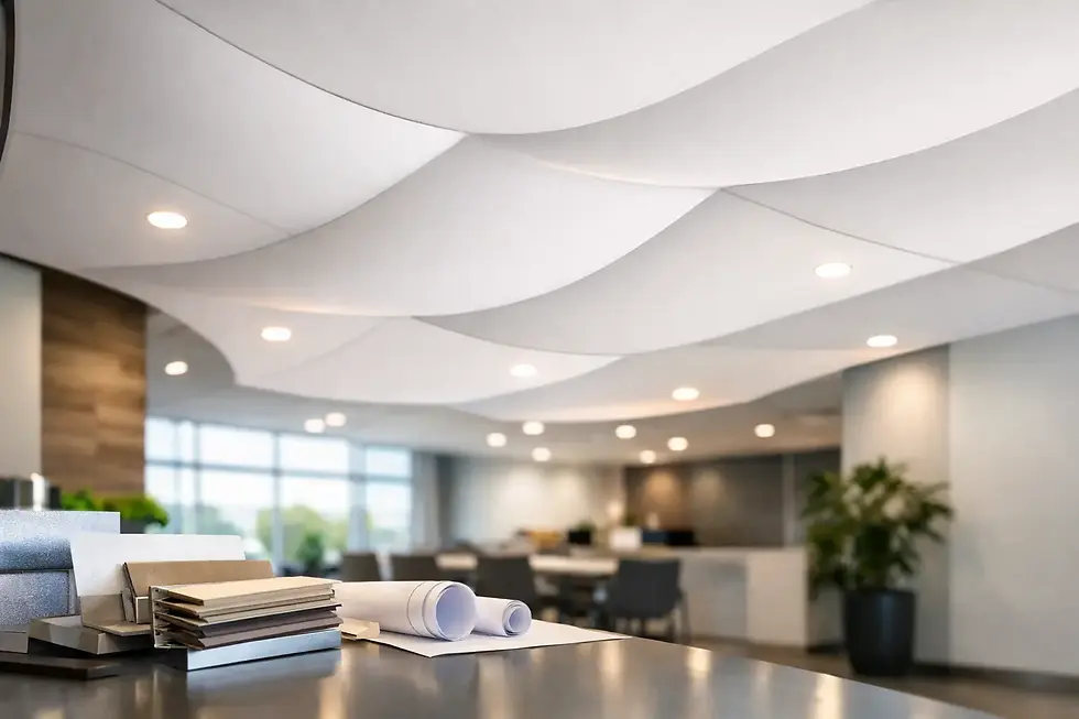
Physical samples and visual mock-ups make these discussions more productive. They allow the design team to review surface finish, colour, illumination and junction details before the ceiling becomes a major installed element. For a brand-led project, that process protects both the design intent and the client’s investment.
Where restraint creates a stronger brand experience
Printed ceilings are not appropriate for every room. In spaces with low ceiling heights, extensive visual clutter or complex service coordination, a full-field graphic may make the room feel compressed. A simpler coloured membrane, a selective printed zone or an illuminated feature may deliver a better result.
There is also a practical question of longevity. Brand campaigns, seasonal retail concepts and short-term activations may justify a bolder, more specific visual treatment. A headquarters, hotel or healthcare facility usually benefits from a design language with a longer lifespan. Rather than printing a current campaign graphic, it may be wiser to use enduring brand colours, abstract forms or imagery rooted in the place itself.
This is where the ceiling can move beyond marketing. It becomes functional art: a surface that establishes mood, improves comfort where acoustic treatment is required, and supports the practical organisation of the room.
Design the ceiling as part of the brand brief
The best time to consider a printed ceiling is when the interior concept is still flexible. Early involvement allows the design team to coordinate membrane geometry, acoustic targets, lighting positions, service penetrations and edge details before tender. It also gives the graphic treatment enough room to develop as part of the architecture rather than as a late-stage addition.
For complex schemes, clear drawings, finish samples, test data and installer coordination reduce uncertainty on site. A manufacturer engineering systems in-house can be particularly useful here, because visual intent and technical detailing are resolved through the same conversation. Nevitec approaches printed ceiling systems in this way: as a single specification where the chosen finish must work alongside the project’s acoustic, fire, lighting and environmental demands.
A brand environment is remembered less for the number of logos it contains than for how it makes people feel when they arrive, pause and move through it. Used with discipline, a printed ceiling gives that experience a clear, lasting point of view.


Comments